
Redefining Dojo’s pricing
INDUSTRY
Fintech
ROLE
Lead Digital Designer
SERVICES
UI
UX
Strategy
User testing
Design systems
CRO
OVERVIEW
Dojo is a payments technology company helping businesses take payements across the UK and Europe. I led the redesign of Dojo’s pricing page, bringing a new bundled approach across plans, hardware and transaction rates to life through UX, UI and user testing.
CHALLENGE
With the new bundle proposition, the challenge was finding the right hierarchy for our core SME audience, while creating an experience that could still speak to Enterprise customers.
24%
The Italian website
5+
The Italian website
x2
The Italian website
200%
The Italian website
Redefining Dojo’s pricing
INDUSTRY
Fintech
ROLE
Lead Digital Designer
SERVICES
UI
UX
Strategy
User testing
Design systems
CRO
OVERVIEW
Dojo is a payments technology company helping businesses take payements across the UK and Europe. I led the redesign of Dojo’s pricing page, bringing a new bundled approach across plans, hardware and transaction rates to life through UX, UI and user testing.
CHALLENGE
With the new bundle proposition, the challenge was finding the right hierarchy for our core SME audience, while creating an experience that could still speak to Enterprise customers.
24%
The Italian website
5+
The Italian website
x2
The Italian website
200%
The Italian website
Redefining Dojo’s pricing
INDUSTRY
Fintech
ROLE
Lead Digital Designer
SERVICES
UI
UX
Strategy
User testing
Design systems
CRO
OVERVIEW
Dojo is a payments technology company helping businesses take payements across the UK and Europe. I led the redesign of Dojo’s pricing page, bringing a new bundled approach across plans, hardware and transaction rates to life through UX, UI and user testing.
CHALLENGE
With the new bundle proposition, the challenge was finding the right hierarchy for our core SME audience, while creating an experience that could still speak to Enterprise customers.
24%
The Italian website
5+
The Italian website
x2
The Italian website
200%
The Italian website
Defining what matters
Research helped us define three core customer personas giving us a clearer understanding of their different needs and priorities. These insights shaped the UX principles that became our framework for design decisions.
Defining what matters
Research helped us define three core customer personas giving us a clearer understanding of their different needs and priorities. These insights shaped the UX principles that became our framework for design decisions.
Defining what matters
Research helped us define three core customer personas giving us a clearer understanding of their different needs and priorities. These insights shaped the UX principles that became our framework for design decisions.
User personas
User personas
Champion clarity: Make pricing and product choices simple to understand
Design for relevance: Surface information customers need, when they need it
Build for confidence: Help customers understand options and make decisions.

Explore, test & iterate
Explore, test & iterate
With the direction set, we explored how plans, hardware and transaction rates should come together within the pricing journey. Through rapid testing and iteration, we learned what mattered most to customers and used those insights to shape the hierarchy and messaging.
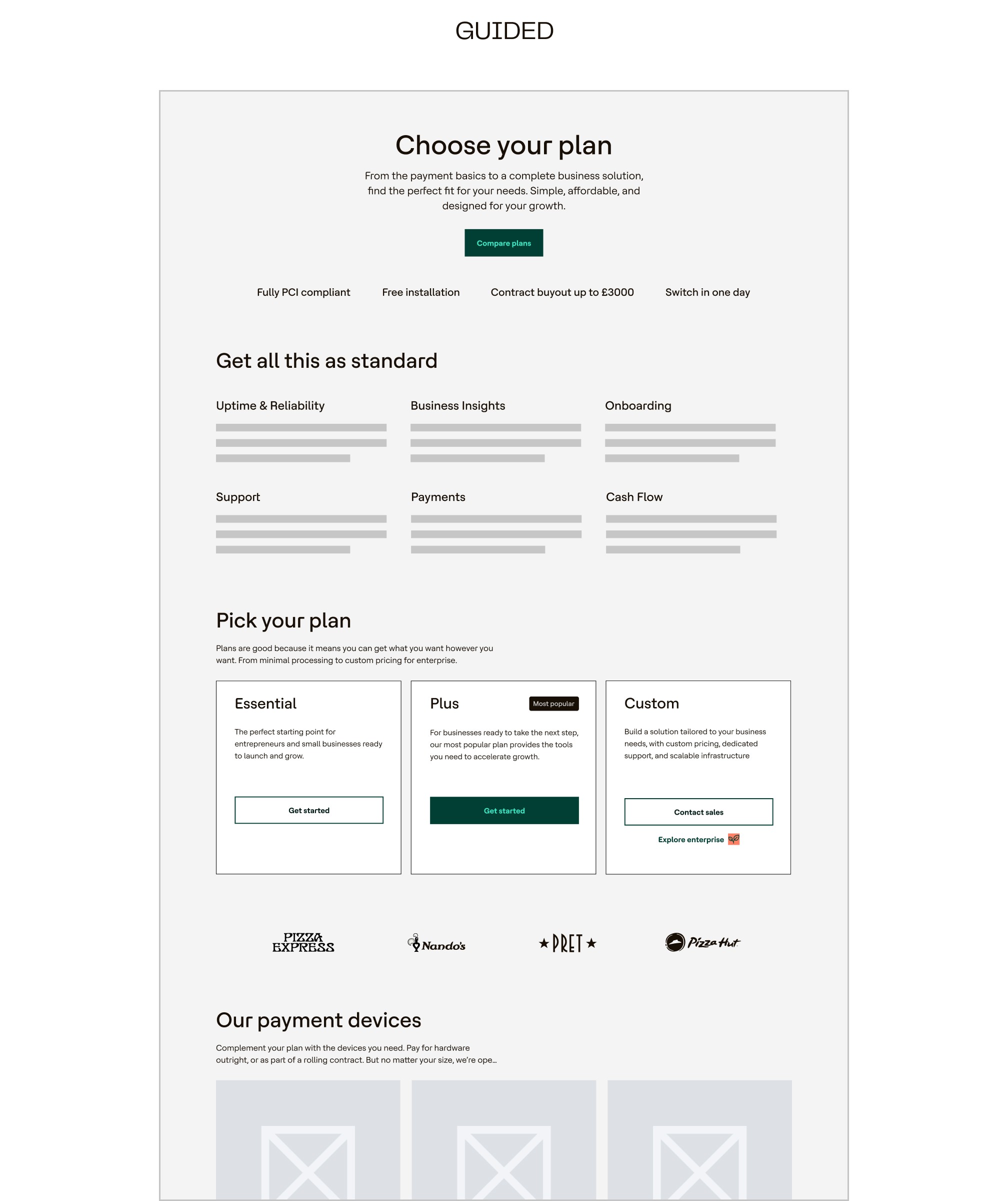
Test 1 - Message Framing
Test 1 - Message Framing
Test: Two different ways of positioning each plan; Guided Vs Direct
Learned: Needs-led messaging made choices clearer
Changed: Reframed plans around customer needs

A shift in direction
We were designing alongside an evolving business strategy, with some parts of the proposition still being worked on. Our initial direction led with value, but senior stakeholder direction shifted the emphasis towards transaction rates - requiring us to rethink the hierarchy as the brief evolved.
A shift in direction
We were designing alongside an evolving business strategy, with some parts of the proposition still being worked on. Our initial direction led with value, but senior stakeholder direction shifted the emphasis towards transaction rates - requiring us to rethink the hierarchy as the brief evolved.
A shift in direction
We were designing alongside an evolving business strategy, with some parts of the proposition still being worked on. Our initial direction led with value, but senior stakeholder direction shifted the emphasis towards transaction rates - requiring us to rethink the hierarchy as the brief evolved.
Test 2 - Transaction Rates
Test 2 - Transaction Rates
Test: Different ways of surfacing transaction rates
Learned: Rates needed context to be meaningful
Changed: Brought rates into the plan comparison

The final experience
We needed to establish a clear understanding of who we were designing for and what they needed from the pricing page. This allowed us to set UX principles that would help guide our decisions, reduce complexity and create a trustworthy transparent experience.
The final experience
We needed to establish a clear understanding of who we were designing for and what they needed from the pricing page. This allowed us to set UX principles that would help guide our decisions, reduce complexity and create a trustworthy transparent experience.
The final experience
We needed to establish a clear understanding of who we were designing for and what they needed from the pricing page. This allowed us to set UX principles that would help guide our decisions, reduce complexity and create a trustworthy transparent experience.

Key UX decisions
Turning our UX principles into clear, purposeful interactions
Key UX decisions
Turning our UX principles into clear, purposeful interactions
Key UX decisions
Turning our UX principles into clear, purposeful interactions
Transaction rates
Clear CTO bands make comparison simple, with subtle colour highlighting the £100K+ band for our core SME audience. ‘Custom rate’ signals flexibility without adding complexity.
Hardware
Hardware is easy to explore and compare, with upfront and monthly costs clearly surfaced. Product specs open a popup modal, keeping customers focused on the pricing journey.
Plans
A consistent card pattern makes plans and costs easy to compare, with equal visual weighting supporting choice. Key features are surfaced upfront, with a deeper comparison table below.
Comparison table
Built to scale up to four plans, with sticky plan titles maintaining context across devices. Clear groupings and icons make differences easy to scan and compare with confidence.
From complexity to clarity
The result was a clear way for customers to navigate a complex pricing proposition, balancing what mattered to them with the needs of the business. It also created a flexible foundation for how Dojo could evolve and communicate it’s pricing.
From complexity to clarity
The result was a clear way for customers to navigate a complex pricing proposition, balancing what mattered to them with the needs of the business. It also created a flexible foundation for how Dojo could evolve and communicate it’s pricing.
From complexity to clarity
The result was a clear way for customers to navigate a complex pricing proposition, balancing what mattered to them with the needs of the business. It also created a flexible foundation for how Dojo could evolve and communicate it’s pricing.
NEXT up


Set the direction
We needed to establish a clear understanding of who we were designing for and what they needed from the pricing page. This allowed us to set UX principles that would help guide our decisions, reduce complexity and create a trustworthy transparent experience.
Comparison table
Built to scale up to four plans, with sticky plan titles maintaining context across devices. Clear groupings and icons make differences easy to scan and compare with confidence.
Comparison table
Built to scale up to four plans, with sticky plan titles maintaining context across devices. Clear groupings and icons make differences easy to scan and compare with confidence.
Set the direction
We needed to establish a clear understanding of who we were designing for and what they needed from the pricing page. This allowed us to set UX principles that would help guide our decisions, reduce complexity and create a trustworthy transparent experience.
Plans
A consistent card pattern makes plans and costs easy to compare, with equal visual weighting supporting choice. Key features are surfaced upfront, with a deeper comparison table below.
Plans
A consistent card pattern makes plans and costs easy to compare, with equal visual weighting supporting choice. Key features are surfaced upfront, with a deeper comparison table below.
Set the direction
We needed to establish a clear understanding of who we were designing for and what they needed from the pricing page. This allowed us to set UX principles that would help guide our decisions, reduce complexity and create a trustworthy transparent experience.
Hardware
Hardware is easy to explore and compare, with upfront and monthly costs clearly surfaced. Product specs open a popup modal, keeping customers focused on the pricing journey.
Hardware
Hardware is easy to explore and compare, with upfront and monthly costs clearly surfaced. Product specs open a popup modal, keeping customers focused on the pricing journey.
Set the direction
We needed to establish a clear understanding of who we were designing for and what they needed from the pricing page. This allowed us to set UX principles that would help guide our decisions, reduce complexity and create a trustworthy transparent experience.
Transaction rates
Clear CTO bands make comparison simple, with subtle colour highlighting the £100K+ band for our core SME audience. ‘Custom rate’ signals flexibility without adding complexity.
Transaction rates
Clear CTO bands make comparison simple, with subtle colour highlighting the £100K+ band for our core SME audience. ‘Custom rate’ signals flexibility without adding complexity.
NEXT UP
